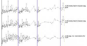
Visualizing what happens during SAT solving has been a long-term goal of mine, and finally, I have managed to pull together something that I feel confident about. The system is fully explained in the liked image on the right, including how to read the graphs and why I made them. Here, I would like to talk about the challenges I had to overcome to create the system.
Gathering information
Gathering information during solving is challenging for two reasons. First, it’s hard to know what to gather. Second, gathering the information should not affect overall speed of the solver (or only minimally), so the code to gather the information has to be well-written. To top it all, if much information is gathered, these have to be structured in a sane way, so it’s easy to access later.
It took me about 1-1.5 months to write the code to gather all information I wanted. It took a lot of time to correctly structure and to decide about how to store/summarize the information gathered. There is much more gathered than shown on the webpage, but more about that below.
Selecting what to display, and how
This may sound trivial. Some would simply say: just display all information! But what we really want is not just plain information: what good is it to print 100’000 numbers on a screen? The data has to be displayed in a meaningful and visually understandable way.
Getting to the current layout took a lot of time and many-many discussions with all all my friends and colleagues. I am eternally grateful for their input — it’s hard to know how good a layout is until someone sees it for the first time, and completely misunderstands it. Then you know you have to change it: until then, it was trivial to you what the graph meant, after all, you made it!
What to display is a bit more complex. There is a lot of data gathered, but what is interesting? Naturally, I couldn’t display everything, so I had to select. But selection may become a form of misrepresentation: if some important data isn’t displayed, the system is effectively lying. So, I tried to add as much as possible that still made sense. This lead to a very large table of graphs, but I think it’s still understandable. Further, the graphs can be moved around (just drag their labels), so doing comparative analysis is not hampered much by the large set of graphs.
The final layout is much influenced by Edward Tufte‘s books. Most graphic libraries for javascript, including what I used, Dygraphs, contain a lot of chartjunk by default. For example, the professional library HighCharts is full chartjunk (just look at their webpage), and is apparently used by many Fortune 500 companies. I was appalled at this — many-many graph libraries, none that offers a clean look? Luckily, I could do away with all that colorful beautifying mess — the data is interesting, and demands no embellishments.
Creating the webpage
Creating the webpage to display what I wanted was quite difficult. I am no expert at PHP or HTML, and this was the first time I had touched javascript. Although the final page doesn’t show it much, I struggled quite a bit with all these different tools. If I had to do this again, I would choose to use a page generation framework. This time, I wrote everything by hand.
I am most proud of two things on the webpage. First is the histogram at the bottom of the graphs. I know it may not seem like it, but that is all done with a javascript I wrote that pulls data from an array that could be dynamically changed. I think it does what it’s supposed to do, and does it well. The second is that I had to tweak the graph library used (Dygraphs, the best library out there, hands down), because it was too slow at printing these ~30 graphs. The graphs can be zoomed (just click and drag on X axis), and when zooming in&out the speed was really terrible. It now works relatively fast though I had to tweak the system to trade speed for a bit of visual beauty.
Final thoughts
Making the visualization webpage was a long marathon. I feel like it’s OK now, even though there were quite a number of ideas that weren’t implemented in the end. I hope you will enjoy playing with it as much as I have enjoyed making it.